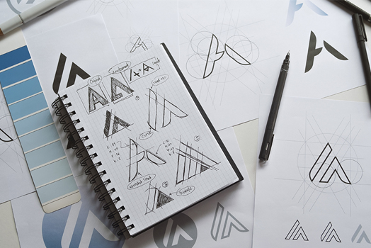
Why Companies Are 'Debranding'?
In recent years, some of the world’s biggest companies have discarded depth and detail to “debrand”. But what prompted this landslide of logo debranding?
From Burger King to Pringles, Volkswagen to Mastercard, global brands have flattened, simplified, and stripped away personality in favor of minimalism. The shift is more than aesthetic—it's strategic. As brands adapt to mobile-first interfaces, dark modes, and an overstimulated digital landscape, clarity has become currency.
The Evolution: From Detail to Digital-First
In the early 2000s, logos were glossy, three-dimensional, and layered. They mimicked physical materials—bevels, shadows, gradients. Today’s design environment is the opposite: flat, fast, responsive. Logos need to render clearly on smartwatches, favicons, and mobile apps. Intricate brand marks simply don’t scale as well.
Less is More — But Also Safer
There’s also a psychological layer to debranding. In an age of cultural sensitivity and constant scrutiny, brands are playing it safe. A neutral, sans-serif logotype feels modern, global, and less likely to alienate. But the flip side? It can also feel... interchangeable.
The Homogenization Problem
When everyone simplifies, everything starts to look the same. Critics argue that debranding has led to a “blanding” crisis—where individuality is lost in the race to look clean. Brands that once had quirky charm or historical depth now lean into clinical neutrality. Is it elegant? Often. Memorable? Less so.
Is Debranding Right for You?
At Company 5.19, we believe simplification should never come at the expense of personality. A modern identity doesn’t have to be sterile. It should be strategic. Design systems can be minimal while still telling a rich story. The key is intention—understanding your audience, your medium, and your voice.
“Design is the silent ambassador of your brand.”
— Paul RandFinal Thoughts
Debranding isn’t going away anytime soon—but the brands that stand out will be those who find clarity without sacrificing character. Whether you’re redesigning your logo, your packaging, or your entire brand system, the goal isn’t just to be simpler. It’s to be unmistakably you.


John Doe
Posted at 15:32h, 06 DecemberLorem Ipsum is simply dummy text of the printing and typesetting industry. Lorem Ipsum has been the industry's standard dummy text ever since the 1500s, when an unknown printer took a galley of type and scrambled it to make a type specimen book. It has survived not only five centuries, but also the leap into electronic typesetting, remaining essentially unchanged. It was popularised in the 1960s with the release of Letraset sheets containing Lorem Ipsum passages, and more recently with desktop publishing software like Aldus PageMaker including versions of Lorem Ipsum.
John Doe
Posted at 15:32h, 06 DecemberIt is a long established fact that a reader will be distracted by the readable content of a page when looking at its layout. The point of using Lorem Ipsum is that it has a more-or-less normal
John Doe
Posted at 15:32h, 06 DecemberThere are many variations of passages of Lorem Ipsum available, but the majority have suffered alteration in some form, by injected humour, or randomised words which don't look even slightly believable. If you are going to use a passage of Lorem Ipsum, you need to be sure there isn't anything embarrassing hidden in the middle of text.
John Doe
Posted at 15:32h, 06 DecemberThe standard chunk of Lorem Ipsum used since the 1500s is reproduced below for those interested. Sections 1.10.32 and 1.10.33 from "de Finibus Bonorum et Malorum" by Cicero are also reproduced in their exact original form, accompanied by English versions from the 1914 translation by H. Rackham.